In this article we explore what it means to create a Jupyter Notebook template for use in initial data exploration. The resulting familiarity with the data can then be utilized as the basis for further detailed analysis, narrative development, feature engineering, etc.
Introduction
When leading teams or managing projects it is often that one will encounter data in different forms such as user feedback, project management metrics, system usage statistics, or performance metrics.
In each of these cases we’d like to be able to analyze the data, develop a narrative describing what the data is telling us, and then create one or more actionable recommendations and/or insights.
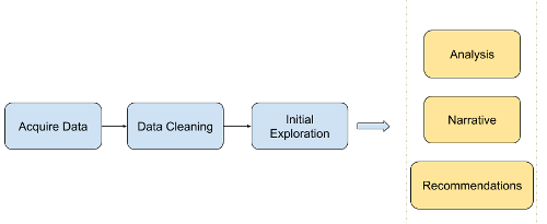
However, the first step is usually becoming familiar with the general ‘shape’ of the data, and then use that as a guide on how to proceed next. We aren’t performing deep dive as of yet; our first goal is simply to become generally familiar with the data, and then allow this to guide us onto the next, more detailed steps.
For example, let us assume we have a corpus of unstructured user feedback on a web application we manage. In this case we might want to understand the most commonly used language in the texts, frequency counts, and review lengths. Based on what we uncover perhaps we’ll notice a high number of negative terms in the texts.
This in turn might lead us to start thinking about how we might more deeply analyze the seemingly negative comments:
- For example, should we categorize the reviews in a way that maps to various areas of the application? Is the data structured in such a way that this is possible?
- If there isn’t a clear categorical delineation should we instead apply an unsupervised K-means clustering algorithm to programmatically create groupings for further investigation?
Based on the groupings we find we could then potentially develop a narrative, a set of actionable recommendations to address the root causes for each category, and Key Performance Indicators (KPIs) to measure progress.
So, in the example above–and indeed the subject of this article–we use initial data exploration to shape and guide our deeper, secondary analysis, narrative development, and recommendations/insights.
Assumptions
Before we begin a few assumptions:
Your data is clean.
Data cleaning is a subject unto itself, and a whole separate article could be written on the topic. But for the purposes of this write up; however, we will assume that your data is mostly clean, and that any issues with missing values, incorrect data types etc has been handled and dealt with before the initial exploration.
So, while we will take a quick look later on at dealing with a few messy records, this article will not explore the subject in detail.
Here is a good resource on the subject if you want to learn more.
You have some basic Python programming skills and access to a Jupyter Notebook environment.
If you use the template from this article most of the programming work has been done for you. You’ll simply need to adjust the template as you see fit to meet your objectives. If on the other hand you need help setting up your Jupyter Notebook environment you can refer to a previous article I wrote on this subject here.
Also note if you need a hand let me know; I’ll be happy to help out as I’m able. :)
Resources
We’ll discuss each the following resources in more detail later on, but we include them here for easy reference:
- You can find the template discussed in this article here
- You can find the modified
Iris Data Setutilized in the template here - You can find the modified
IMDB Movie Reviews Settext utilized in the template here
Let’s Get Started!
So, having said all that, let’s get started!
Sample Data
The first thing we need to do; however, is obtain example data to execute the template against to illustrate how it works.
To do this we’ll be utilizing two freely and commonly referred to example data sets:
Note that we’ve made two modifications to these data sets:
-
For the
Iris Data Setwe’ve added two new records to the set to simulate non-numeric and NaN issues. You can find our modified version here. -
For the
IMDB Movie Reviews Setwe already cleaned and processed the review text to use it directly in the template. You can find our modified version here.
Jupyter Notebook Template
Once we have access to the data sets we can utilize the Jupyter Notebook Template (found here) to gain the initial idea of what the data looks like and plan our next actions.
Let’s break down what the template is doing section-by-section:
Load libraries and data
Libraries
We start by importing the Python libraries we’ll need for our initial data exploration:
# Configure the notebook
%matplotlib inline

import warnings
warnings.filterwarnings('ignore')
# Load libraries
import numpy as np

import pandas as pd
from pandas import read_csv
from pandas.plotting import scatter_matrix
from pandas import set_option
from pandas import DataFrame

from matplotlib import pyplot

from wordcloud import WordCloud, STOPWORDS

import pickle

import nltk
from nltk.probability import FreqDist

import os
Data
Note we are loading a modified Iris data set and a IMDB Movie Reviews data set. You can download these files here and here, and we assume you’ve placed the data sets in a directory called datasets in the same root folder as this template like so:
├── datasets
│   ├── iris.data.csv
│   └── reviews.obj
Let’s go ahead and load the data files:
dataFile = os.path.join('.', 'datasets', 'iris.data.csv')
data = read_csv(dataFile, header = 0)
filehandler = open(os.path.join('.', 'datasets', 'reviews.obj'), 'rb')
reviews = pickle.load(filehandler)
Helper functions
Next we want to write a quick helper function, corrTableColors(). This function allows us to set rules on when to apply colors to the correlation table values which we’ll create below.
Note that the threshold values in the function can be altered to meet your needs as required. For example, we are highlighting any correlation values greater or less than 0.7, but these can easily be altered for your project data.
def corrTableColors(value):
    # Default color
    color = 'black'

    if value == 1:
        color = 'white'
    elif value < -0.7:
        color = 'red'
    elif value > 0.7:
        color = 'green'

    return 'color: %s' % color
Inspect and visualize the data (Iris Data Set)
Now we are ready for the fun part: Inspecting the data and learning more about how it is structured!
We’ll utilize the Iris Data Set for the steps below, so that we can see how the commands work on an actual data set.
Non-Visual Exploration
We start with a non-visual exploration where the properties of the data are examined such as the number of records, the data types, descriptive statistics, correlations, etc.
Shape
The command below will return the number of rows by number of columns which are also referred to as observations and variables:
print("data.shape = ", data.shape)
data.shape = (152, 5)
Thus we have 152 rows/observations and 5 columns/variables.
First 10 rows
Using the head command we can examine the first 10 records:
print(data.head(10))
  sepalLength  sepalWidth  petalLength  petalWidth        class
0         5.1         3.5          1.4         0.2  Iris-setosa
1         4.9         3.0          1.4         0.2  Iris-setosa
2         4.7         3.2          1.3         0.2  Iris-setosa
3         4.6         3.1          1.5         0.2  Iris-setosa
4         5.0         3.6          1.4         0.2  Iris-setosa
5         5.4         3.9          1.7         0.4  Iris-setosa
6         4.6         3.4          1.4         0.3  Iris-setosa
7         5.0         3.4          1.5         0.2  Iris-setosa
8         4.4         2.9          1.4         0.2  Iris-setosa
9         4.9         3.1          1.5         0.1  Iris-setosa
We can clearly see that the first four columns are numeric data, and the last column appears to be classification labels.
We aren’t sure at this point; however, what the ranges of the numeric data are or how many labels we are dealing with. We’ll explore this later on.
Data Types
Let’s confirm our assumption that the first four columns are numeric. To do this we examine the output of the dtypes command:
print(data.dtypes)
sepalLength     object
sepalWidth     float64
petalLength    float64
petalWidth     float64
class           object
dtype: object
OK, this is interesting! The dtypes command appears to think we have some non-numeric data in the sepalLength column, and we know this because it classifies the column as the object type.
Spoiler alert: Remember when I said above that we are using a modified version of the Iris Data Set? This is the reason: I intentionally placed two problematic records into the data to simulate what might happen if a few slipped through our initial cleaning. Below we’ll take a few basic actions to mitigate this…
If we sort of the data in descending order the non-numeric values should float to the top and give us a better idea of what is occurring:
data['sepalLength'].sort_values(ascending = False).head(5)
151    abc
131    7.9
135    7.7
118    7.7
117    7.7
Name: sepalLength, dtype: object
Ahah! It appears that record 151 has a typo: Someone (i.e. me) put the value abc into the field instead of an actual numeric value.
Let’s drop the record and recast the column into a numeric data type.
Note that in this case it is perfectly fine for us to drop the record, because we are working on initial data exploration. At this point we simply want to get a sense of the story the data is telling us, and so removing a few problematic records shouldn’t affect this outcome.
# Drop the erroneous record; likely a data entry error
data.drop(151, inplace = True)

# Recast the column into numeric values
data['sepalLength'] = pd.to_numeric(data['sepalLength'])

# Confirm our work
print(data.dtypes)
sepalLength    float64
sepalWidth     float64
petalLength    float64
petalWidth     float64
class           object
dtype: object
We now see that all the columns are numeric except the last column which we assumed contained classification label data.
Another item we should check for is NULL values. Python does not use the NULL keyword, and instead uses NaN and None to represent a NULL.
We can quickly check for this as follows:
# isnull() will find both NaN and None values in a dataframe
# Let's see how many we have and count them up
data.isnull().sum()
sepalLength    0
sepalWidth     1
petalLength    0
petalWidth     0
class          0
dtype: int64
It appears we have one NaN/None value in our data set. Let’s go ahead and drop it, so we can continue with the exploration:
#Drop any NaN/None values from our data set and then confirm we've removed them all:
data.dropna(inplace = True)

# Confirm our work
data.isna().sum()
sepalLength    0
sepalWidth     0
petalLength    0
petalWidth     0
class          0
dtype: int64
As a reminder: Data cleaning is a whole subject unto itself, which could have an entire article dedicated to this subject alone. For this write up; however, we are assuming your data is mostly clean, and we’ve just covered two basic commands to deal with a few records that might have slipped through.
Descriptive stats
Next we can take a look at the descriptive statistics for the numeric data in our set:
# Expand the width of the displayed table
set_option('display.width', 200)

# Set the decimal place at two places
set_option('precision', 2)

# Output descriptive statistics
data.describe()
| sepalLength | sepalWidth | petalLength | petalWidth | |
|---|---|---|---|---|
| count | 150.00 | 150.00 | 150.00 | 150.00 |
| mean | 5.84 | 3.05 | 3.76 | 1.20 |
| std | 0.83 | 0.43 | 1.76 | 0.76 |
| min | 4.30 | 2.00 | 1.00 | 0.10 |
| 25% | 5.10 | 2.80 | 1.60 | 0.30 |
| 50% | 5.80 | 3.00 | 4.35 | 1.30 |
| 75% | 6.40 | 3.30 | 5.10 | 1.80 |
| max | 7.90 | 4.40 | 6.90 | 2.50 |
We can see for example that the sepalLength values fluctuate between 4.3 and 7.9, and that the standard deviation (std) is relatively small for this data set. This implies that most of the data is close to the mean, and that we don’t have a wide range of values to consider.
We can also note that the numeric values seem to be on similar scale.
Note that scale is important, because if you were planning on using an algorithm such as linear regression, neural networks, K-means, etc. as part of your narrative/analysis you’d need to take into scaling into account.
For example, when dealing with data such as housing you might value such as $450,000 for the house price and the value 3 for the number of bathrooms. In these cases you’d need to apply normalization and/or standardization techniques to mitigate the variances between the value scales.
For example, we wouldn’t want the computer to become confused and think that the number of bathrooms was so small in comparison to the house price that it had no effect, which is quite the opposite!
While these topics are out-of-scope for this article, if you want to learn more you can read more about them here.
Class distribution
Let’s examine the last column which appeared to be categorization labels for each row. How many different classes/labels are we dealing with?
data.groupby('class').size()
class
Iris-setosa        50
Iris-versicolor    50
Iris-virginica     50
dtype: int64
We note that we have an even distribution of classes/labels among the samples.
If you were planning on using data modeling this would be important, because you’d have to account for a disparity in the number of classes within the observations if an imbalance existed.
For example, if we have one thousand positive comments and four negative ones, it would be hard to draw convincing conclusions, identify trends, or make recommendations on how we could improve on the four negative samples alone.
Correlation
Next we examine the data for correlations using the corr() command. We also utilize the helper function, corrTableColors(), we wrote above to make reading the table easier.
As stated before, if you want to change the color thresholds to fit your needs this should be easy to do.
corr = data.corr(method = "pearson")
corr.style.applymap(corrTableColors)
| sepalLength | sepalWidth | petalLength | petalWidth | |
|---|---|---|---|---|
| sepalLength | 1.00 | -0.11 | 0.87 | 0.82 |
| sepalWidth | -0.11 | 1.00 | -0.42 | -0.36 |
| petalLength | 0.87 | -0.42 | 1.00 | 0.96 |
| petalWidth | 0.82 | -0.36 | 0.96 | 1.00 |
Unsurprisingly the data set has one or more positive correlations present, which our intuition would have told us would be the case in data concerning plants.
In a real-world data set this would potentially provide us areas to investigate further. For example, assume we had metrics on the number of clicks required to perform some task, and metrics on the time taken for a web page to load. We could examine the correlation between these two metrics and the reported user satisfaction rating for the system in order to identify potential positive or negative relationships.
We would expect to find that requiring the user to click excessively together with long loading times would increase dissatisfaction, and the correlation table could help us empirically identify this linkage.
Skew
Skewness is a measure of how long the ‘tails’ are in the data. Here is an image to illustrate:
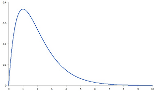
In this image the ‘tail’ of the data drifts off to the right, and this is called positive skewness. If on the other hand the tail would have drifted off to the left we would have said the data had negative skewness.
Skewness might interest you if you are concerned about data that doesn’t follow the bell curve (also known as a normal distribution).
For example, let us assume we are examining data from a project concerning customer hold times. If we saw positive skewness in the data we might be concerned, because the long right-side tail would imply some customers are having potentially excessive wait times which in turn could negatively impact customer satisfaction.
Let’s see how we can view a numeric representation of skewness for our sample data:
data.skew()
sepalLength    0.31
sepalWidth     0.33
petalLength   -0.27
petalWidth    -0.10
dtype: float64
For a normal distribution the skew would be zero. Our data set has skewness values close to zero, so there does not appear to be any significant positive or negative skew.
We’ll also be able to visually confirm this in the next section.
Visualizations
Now that we’ve finished with the non-visual data exploration let’s employ some graphical techniques and see what we can find. :)
Histograms
Creating histograms for our sample data set is extremely easy as show in the code below:
# Control how big the histogram images are
data.hist(figsize = (8,8))

# Draw the histograms
pyplot.show()
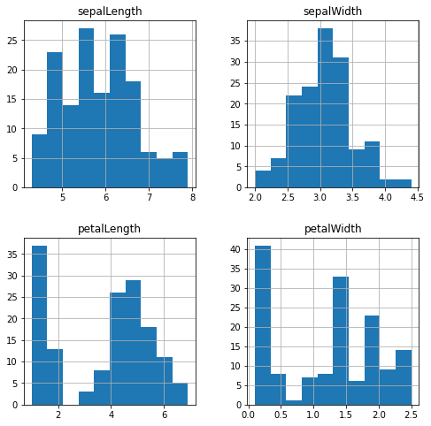
The histograms confirm what we learned earlier about skewness in the data, and both sepalLength and sepalWidth appear to normal distributions (i.e. follow the bell curve).
petalLength and petalWidth on the other hand appear to be bimodal distritubtions. Or that is to say they appear to have two ‘peaks’ in their value distributions.
A bimodal (or multimodal if there are more than two peaks) might be of interest to you if you were considering scheduling or queue analysis data for example.
Let’s assume that we were working on a project to deploy an online restaurant point of sale (POS) system, and we wanted to ensure the system was responsive during peak hours (i.e. non-functional requirements). Examining the sales data for the restaurant hour-by-hour would likely reveal a bimodal distribution with two peaks: One at breakfast and another at lunch.
We could use these peaks to calculate the capacity and scalability requirements for the system, recommend on-demand load balancing for the back end POS servers during peak hours, etc.
Density plots
Density plots can be thought of as plots of smoothed histograms. This assists in examining the ‘shape’ of the data, and are easier to read–for me anyhow–when considering distribution and multimodal distribution types.
Let’s take a look:
# Create the density plots in a 2x2 layout
data.plot(
    kind = 'density',
    subplots = True,
    layout = (2,2),
    sharex = False,
    figsize = (8,8)
)

# Draw the plots
pyplot.show()
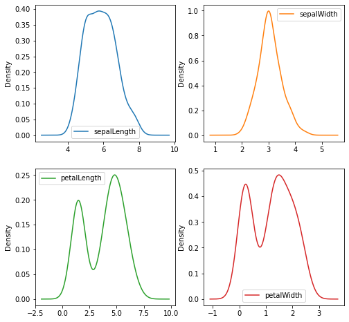
These plots make it very easy to gauge the distribution of the data as well as the presence of a multimodal distribution.
So for example we can clearly see that the petalLength and sepalWidth follow a bell curve, and that the petalLength and petalWidth values are indeed bimodal.
We also have an additional confirmation regarding the lack of skewness of the data as covered earlier.
Box and whisker plots
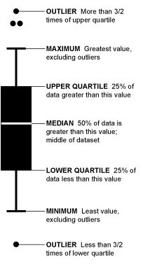
Box and whisker plots are fantastic data visualization tools–although they can be non-intuitive to decipher at first. Here is a quick two-minute article on how to interpret them, and here is an info graphic explanation from that same source:
Creating them in our notebook is easy too:
# Create the box-and-whisker plots in a 2x2 layout
data.plot(
    kind="box",
    subplots = True,
    layout = (2,2),
    sharex = False,
    sharey = False,
    figsize = (8,8)
)

# Draw the graphs
pyplot.show()
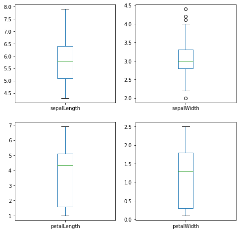
We can note that the box-and-whisker plots contain a lot of information about our data set in a compact form:
- By examining the Y-axis values and ‘whiskers’ it is clear the data has a value spread of about 1 to 8 centimeters
- Other than the
sepalWidthvariable, the data does not contain outliers - The interquartile range (IQR) also appears to have a narrow spread with the greatest amount of variation occurring in the
petalLenghvalues - We can quickly identify the median value for each variable by examining the value of the green bar. For example,
sepalWidthappears to have a median of about 5.75.
Scatter plot matrix
We next consider a scatter plot matrix, which allows us to visually estimate correlations similar to how we did this above using quantitative means:
scatter_matrix(data, figsize=(10, 10), s = 200)
pyplot.show()
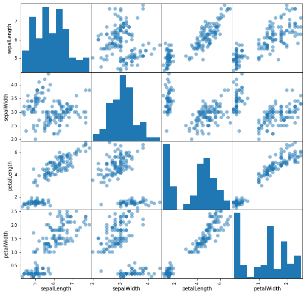
The scatter plot matrix reinforces visually what we saw above in the correlations table.
For example, we see that data points for petalLength vs. petalWidth increase steadily towards the upper right side of the graph in a diagonal line. If we consult the correlations table we created earlier we find that these two variables are highly correlated at 0.96.
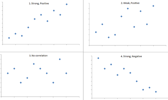
On the other hand, if we saw data points on the graph decreasing towards the lower right side of the graph we would acknowledge that there was negative correlation.
sepalWidth and sepalLength on the other hand don’t seem to have much correlation present since there doesn’t appear to be a clear pattern in the plotted data points. The correlation table confirms with a recorded value of -0.11 for these two variables.
Here is a visual explanation of these concepts:
Unstructured Text (IMDB Reviews)
At this point we are staring to have a good initial understanding of what our data looks like. However, what if we have unstructured natural language data such as customer reviews as part of our collection?
In this section we’ll cover three easy techniques to analyze and assess unstructured textual data.
For our example data set we are going to use the IMDB Movie Reviews data set we loaded at the beginning of this notebook.
Note that we’ve already cleaned up the text by removing punctuation and other non-alphabetic values, set all the text to lower case, removed stop words such as ‘a’, ‘and’, ‘the’, etc., and each review is on a separate line.
Let’s take a quick peek at one of the records we’ll be working with:
reviews[110]
'truly dreadful know initially kiwi effort soon started realize characters speaking hardly disguised kiwi accents fake american ones need set n america anyway could set nz actors could used normal voices surely someone production team could hear dreadful attempts speaking american accents bad bad surprised lasted long make seemed like poor attempt segal willis type action man flick total waste money taxpayer money piece trash would leading revolution money put back treasury still reeling get pun reeling absolute garbage seen continue watch well fanatic cant help'
From all the negative words I think it’s pretty clear someone didn’t like this movie!
World Clouds
The first technique we’ll cover is a word cloud.
Google says a word cloud is “an image composed of words used in a particular text or subject, in which the size of each word indicates its frequency or importance.”
Thus, the more often a specific word appears in the text, the bigger and bolder those words will appear in the word cloud.
So, for example if we were to utilize a word cloud on a corpus of text related to customer support tickets it might help us to gain an initial understanding of the most common issues. We might see the word ‘slow’ or ‘missing’ occur for a system that had latency and data errors.
Let’s create one from our data, and see what it looks like:
# Generate wordcloud
wordcloud = WordCloud(
    random_state=1,
    background_color='black',
    colormap='Set2',
    collocations=False,
    stopwords = STOPWORDS).generate(' '.join(reviews))

wordcloud.to_image()

We quickly have a powerful graphical analysis tool with almost no code!
The words ‘good’ and ‘time’ have the 2nd and 3rd largest font size respectively. We also see the word ‘bad’ in the word cloud, but its font size is much smaller.
From this we can form an initial assumption that our sample of movie reviews contains more positive reviews than negative. Now of course we’d need to empirically validate this with further analysis, but for an initial data exploration it serves the purpose of helping us form a story in our mind of what the data is telling us and how to proceed next.
Numerical Word Frequency Counts
If after creating the word cloud we want to know the exact word count frequencies for words appearing the greatest and least amount of times we can do that like so:
# Count the number of times each word appears in the text(s)
data_analysis = nltk.FreqDist(' '.join(reviews).split())
Now we can view the top 10 most frequent words in the data set:
data_analysis.most_common(10)
[('one', 26788),
 ('like', 20274),
 ('good', 15140),
 ('time', 12724),
 ('even', 12646),
 ('would', 12436),
 ('story', 11983),
 ('really', 11736),
 ('see', 11475),
 ('well', 10662)]
And what if we wanted to know the top 10 least frequent words?
Easy enough:
data_analysis.most_common()[-10:]
[('riiiight', 1),
 ('imy', 1),
 ('jayden', 1),
 ('concider', 1),
 ('acids', 1),
 ('crahan', 1),
 ('substitutions', 1),
 ('daeseleire', 1),
 ('shortsightedness', 1),
 ('unfairness', 1)]
Sentence Lengths
Next we’ll examine the length of each record in the reviews.
First let’s calculate the number of words per review, and store them in their own column:
reviewsDF = pd.DataFrame(reviews, columns = ['Review Text'])
reviewsDF['Word Count'] = [len(x.split()) for x in reviewsDF['Review Text']]
We can examine how many words are in the first five reviews with the head() command:
reviewsDF.head()
| Review Text | Word Count | |
|---|---|---|
| 0 | stuff going moment mj started listening music ... | 214 |
| 1 | classic war worlds timothy hines entertaining ... | 80 |
| 2 | starts manager nicholas bell giving welcome in... | 238 |
| 3 | must assumed praised greatest filmed opera eve... | 184 |
| 4 | superbly trashy wondrously unpretentious explo... | 208 |
Next we can use the describe() function as we did on the Iris data to create descriptive statistics for the number of words in each review:
reviewsDF['Word Count'].describe()
count    25000.00
mean       116.16
std         89.16
min          3.00
25%         61.00
50%         86.00
75%        141.00
max       1416.00
Name: Word Count, dtype: float64
What is really interesting here is the spread of the values. The std statistic alone gives us an indication there is a lot of variance at 89.16, and if we next examine the min and max entries we see values of 3 and 1,416 respectively.
(For reference 1,416 words is about three pages!)
Clearly we had two individuals with very different levels of motivation when it came to authoring movie reviews…
We can also depict this visually via a histogram:
ax = reviewsDF['Word Count'].hist();
ax.set_xlabel("Number of words")
ax.set_ylabel("Number of records")
Text(0, 0.5, 'Number of records')
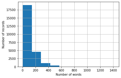
Whether or not the variance in record length matters will be up to you and your situation.
For example, if this was unstructured text containing user comments on application performance perhaps I would remove records with less than twenty words and more than five hundred. I might not feel that a record of less than twenty words or more than five hundred would have the concise details I needed to perform a proper root cause analysis.
Again; however, this will be up to you and your domain knowledge of your data.
As a final note, if we wanted to review the five records with the least amount of words we could do this:
reviewsDF.sort_values(by = ['Word Count'], ascending = True).head()
| Review Text | Word Count | |
|---|---|---|
| 20276 | terrible good effects | 3 |
| 22258 | ming merciless little bardwork foul | 5 |
| 9245 | better choose paul verhoeven even watched | 6 |
| 23558 | rent one even dollar rental night | 6 |
| 4048 | adrian pasdar excellent makes fascinating woman | 6 |
This not only gives us the word count for each record, but also the content and the row index where the record can be found in the data set (i.e. the values in the table’s first column).
If you wanted to see the records with the largest number of words you could replace ascending = True with ascending = False like so:
reviewsDF.sort_values(by = ['Word Count'], ascending = False).head()
| Review Text | Word Count | |
|---|---|---|
| 3485 | match tag team table match bubba ray spike dud... | 1416 |
| 20982 | titanic directed james cameron presents fictio... | 903 |
| 20347 | attention spoilers first let say rob roy one b... | 892 |
| 10503 | probably heard bit new disney dub miyazaki cla... | 853 |
| 6864 | praised atlantis lost empire disney adventure ... | 805 |
Wrapping Up
In this article we covered how to create a Jupyter Notebook template for initial data exploration. We then explored how to load the data, perform some simple cleaning operations, explore the data using numerical and graphic techniques, and we also examined three ways to initially analyze unstructured natural language data.
On the basis of this template we have gained a deeper understanding of the story the data had to tell us, and next we could take a deeper dive into narrative development, actionable recommendations, or KPIs and baselines to measure future data sets against.
If you have any methods, strategies, or experiences building out your own initial data exploration process and would like to share I would love to hear about them! Please let me know either in the comments or via email, and I will add them to this article (giving you full credit of course!).
I’d also be more than happy to answer any questions you may have after reading this, or if you have any problems setting up your own Jupyter Notebook environment and need a hand.
Thank you.


Comments